Setting up the environment#
To set up the environment needed to run this code, visit this repository. The repository contains detailed setup instructions in the README.md file, including how to install dependencies via the requirements.txt.
In this notebook, we will configure the Python environment for data science and statistics. You will learn how to install and use essential libraries like Pandas, NumPy, and Matplotlib, and we’ll explore their functionalities through hands-on examples.
1. Python setup#
Required libraries:#
Pandas: For data manipulation and analysis.
NumPy: For numerical operations.
Matplotlib and Seaborn: For data visualization.
Statsmodels: For statistical modeling and hypothesis testing.
Scipy: For advanced statistical operations.
Importing libraries#
# Import libraries
import pandas as pd
import numpy as np
import matplotlib.pyplot as plt
import seaborn as sns
import statsmodels.api as sm
import scipy.stats as stats

# Set default settings for visualizations
sns.set(style="whitegrid")
plt.rcParams["figure.figsize"] = (10, 6)
2. Introduction to statistical tools and datasets#
Example: Loading a sample dataset#
We will use the built-in dataset tips from Seaborn for demonstrations.
# Load sample dataset
tips = sns.load_dataset("tips")

# Display the first five rows
print(tips.head())
   total_bill   tip     sex smoker  day    time  size
0       16.99  1.01  Female     No  Sun  Dinner     2
1       10.34  1.66    Male     No  Sun  Dinner     3
2       21.01  3.50    Male     No  Sun  Dinner     3
3       23.68  3.31    Male     No  Sun  Dinner     2
4       24.59  3.61  Female     No  Sun  Dinner     4
Exploring the Dataset#
# Summary statistics of the dataset
print("Descriptive statistics for this dataset")
pd.DataFrame(tips.describe())
Descriptive statistics for this dataset
| total_bill | tip | size | |
|---|---|---|---|
| count | 244.000000 | 244.000000 | 244.000000 |
| mean | 19.785943 | 2.998279 | 2.569672 |
| std | 8.902412 | 1.383638 | 0.951100 |
| min | 3.070000 | 1.000000 | 1.000000 |
| 25% | 13.347500 | 2.000000 | 2.000000 |
| 50% | 17.795000 | 2.900000 | 2.000000 |
| 75% | 24.127500 | 3.562500 | 3.000000 |
| max | 50.810000 | 10.000000 | 6.000000 |
Statistics allows us to uncover valuable insights hidden within data. With Python, we can efficiently apply statistical concepts and extract meaningful information in no time. In this course, you’ll learn not only how to calculate descriptive statistics but also how to interpret them and derive actionable insights that can drive decision-making.
# Check for missing values
pd.DataFrame(tips.isnull().sum())
| 0 | |
|---|---|
| total_bill | 0 |
| tip | 0 |
| sex | 0 |
| smoker | 0 |
| day | 0 |
| time | 0 |
| size | 0 |
3. Visualizing Data#
Example: Distribution of Total Bills#
# Plot the distribution of total bills
sns.histplot(
    tips["total_bill"],
    kde=True,
    color="blue"
)
plt.title("Distribution of total bills")
plt.xlabel("Total bill ($)")
plt.ylabel("Frequency")
plt.show()
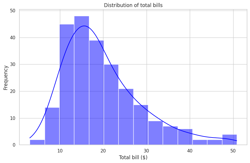
Statistical Distributions and Insights from Histograms#
Statistical distributions and histograms are powerful tools for visually uncovering patterns and insights in data, making them essential for informed decision-making.
This plot, showing the distribution of total bills, can provide a variety of insights depending on the context and objectives of the analysis. Let’s explore some of the key insights that this plot can reveal:
Spending Behavior:
The overall shape of the distribution can reveal general customer spending patterns, such as:Where the majority of bills lie (e.g., most frequent total bill amounts).
How spending habits differ across low, moderate, and high bill amounts.
Identifying Common Ranges:
The histogram highlights the range of bill amounts that are most common. This information helps businesses understand where the majority of their revenue comes from and optimize pricing strategies.Variability in Spending:
The spread of the distribution can indicate variability in customer spending:A narrow spread suggests consistent spending.
A wider spread implies more diverse spending habits.
Presence of Outliers:
The extremely high or low values in the distribution can signal outliers, such as:Large group orders or unusual customer behavior.
Extremely low bills that might indicate promotions or discounts.
Opportunities for Targeted Strategies:
If certain ranges of spending dominate (e.g., mid-range bills), marketing campaigns, menu pricing, or promotions can target those segments effectively.
Additionally, identifying smaller segments (e.g., high spenders) could help design premium services or upselling opportunities.Customer Segmentation:
This distribution could form the basis for segmenting customers into groups:Budget-conscious customers (low bills).
Average spenders (middle-range bills).
High-value customers (upper-range bills).
Revenue Optimization:
By analyzing the distribution, businesses can focus on optimizing menu items or services that cater to the most common spending ranges while creating strategies to attract higher spenders.Informing Future Analysis:
This plot also serves as a foundation for deeper analyses, such as:Exploring correlations with other variables (e.g., tips, party size, or time of day).
Investigating whether spending patterns vary across weekdays vs. weekends or lunch vs. dinner.
By leveraging insights like these, businesses can better understand their customer base, optimize operations, and create targeted strategies to improve both customer experience and revenue.
We will explore this topic further in section 7. Exploratory Data Analysis for a more comprehensive understanding.
Example: Relationship Between Total Bill and Tip#
# Scatter plot with regression line
sns.regplot(
    x="total_bill",
    y="tip",
    data=tips,
    color="green"
)
plt.title("Total bill vs tip")
plt.xlabel("Total bill ($)")
plt.ylabel("Tip ($)")
plt.show()
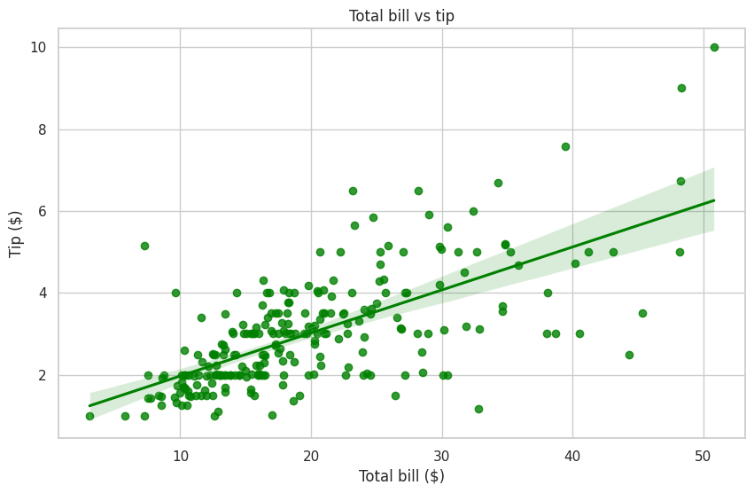
Insights from scatterplots#
A scatterplot is a visualization tool used to plot data points on a two-dimensional graph. Each point represents a single observation, with its position determined by the values of two numerical variables. Scatterplots are widely used in statistics and data analysis to understand relationships, trends, and variability.
This scatterplot, showing the relationship between total bills and tips, along with a regression line, provides several types of insights that can be derived:
Relationship Between Variables:
The scatterplot helps identify the overall trend or relationship between total bill amounts and tips.
The regression line and confidence interval provide a visual indication of the general direction and strength of this relationship.
Tipping Patterns:
The distribution of points reveals how tipping behavior varies with the total bill amount. For example, do higher bills correspond to higher tips?
It can help identify whether tipping behavior is consistent across different spending levels or varies significantly.
Variability in Tips:
The spread of points around the regression line shows the variability in tips for a given bill amount.
Wider spreads indicate more diverse tipping habits, while narrower spreads suggest more consistent behavior.
Potential Outliers:
Points that fall far from the regression line could indicate outliers in tipping behavior.
These could represent unusually high or low tips for a given bill amount, which might warrant further investigation.
Tipping Trends:
The slope of the regression line provides insight into how much tips typically increase as the total bill increases.
Understanding this trend can help businesses estimate expected tips based on bill size.
Customer Segmentation:
Grouping data points can reveal different customer tipping behaviors, such as:
Customers who tip proportionally higher relative to their bills.
Customers who tip less consistently regardless of the bill amount.
Opportunities for Business Strategies:
If tips increase steadily with bill size, businesses could explore strategies to encourage higher spending (e.g., upselling or offering premium services).
If tipping behavior is inconsistent, businesses might consider training staff or suggesting tipping guidelines to encourage better tipping practices.
Correlation Analysis:
The plot visually suggests whether there is a positive, negative, or no correlation between total bill amounts and tips.
This can serve as the basis for statistical analyses to quantify the strength of the relationship.
Informing Future Analysis:
This plot can guide further questions, such as:
Do tipping trends differ by party size, time of day, or day of the week?
Are there any systematic differences in tipping behavior across customer segments?
By analyzing these types of insights, businesses can better understand tipping dynamics, optimize service strategies, and enhance customer experiences.
We will explore this topic further in section 7. Exploratory Data Analysis for a more comprehensive understanding.
Insights from Scatterplots#
A scatterplot is a visualization tool used to plot data points on a two-dimensional graph. Each point represents a single observation, with its position determined by the values of two numerical variables. Scatterplots are widely used in statistics and data analysis to understand relationships, trends, and variability.
This scatterplot, showing the relationship between total bills and tips (x-axis: total bill, y-axis: tip), along with a regression line, provides several types of insights that can be derived:
Relationship Between Variables:
The scatterplot helps identify the overall trend or relationship between total bill amounts and tips.
The regression line and its confidence interval provide a visual indication of the general direction and strength of this relationship.
Tipping Patterns:
The distribution of points reveals how tipping behavior varies with the total bill amount. For example, do higher bills correspond to higher tips?
It can help identify whether tipping behavior is consistent across different spending levels or varies significantly.
Variability in Tips:
The spread of points around the regression line shows the variability in tips for a given bill amount.
Wider spreads indicate more diverse tipping habits, while narrower spreads suggest more consistent behavior.
Potential Outliers:
Points that fall far from the regression line could indicate outliers in tipping behavior.
These could represent unusually high or low tips for a given bill amount, which might warrant further investigation.
Tipping Trends:
The upward slope of the regression line provides insight into how tips typically increase as the total bill increases.
Understanding this trend can help businesses estimate expected tips based on bill size.
Customer Segmentation:
Grouping data points can reveal different customer tipping behaviors, such as:
Customers who tip proportionally higher relative to their bills.
Customers who tip less consistently regardless of the bill amount.
Opportunities for Business Strategies:
If tips increase steadily with bill size, businesses could explore strategies to encourage higher spending (e.g., upselling or offering premium services).
If tipping behavior is inconsistent, businesses might consider training staff or suggesting tipping guidelines to encourage better tipping practices.
Correlation Analysis:
The plot visually suggests whether there is a positive, negative, or no correlation between total bill amounts and tips.
This can serve as the basis for statistical analyses to quantify the strength of the relationship.
Informing Future Analysis:
This plot can guide further questions, such as:
Do tipping trends differ by party size, time of day, or day of the week?
Are there any systematic differences in tipping behavior across customer segments?
By analyzing these types of insights, businesses can better understand tipping dynamics, optimize service strategies, and enhance customer experiences.
We will explore this topic further in section 7. Exploratory Data Analysis for a more comprehensive understanding.
4. Performing Basic Statistical Analysis#
Example: Hypothesis Testing#
What is Hypothesis Testing?#
Hypothesis testing is a statistical method used to evaluate and decide whether there is enough evidence in a sample of data to infer that a certain condition or statement is true for the entire population. It is a fundamental process in statistics, enabling decision-making under uncertainty.
In the descriptive statistics for this dataset, we observed that the mean tip is close to \\(3** (2.998279). In this section, we will perform a hypothesis test to determine if the average tip is statistically significantly different from **\\\)3. This will help us confirm whether the observed mean could be due to random variation or represents a true difference.
# Perform a one-sample t-test
sample_mean = tips["tip"].mean()
null_hypothesis_mean = 3

# Null Hypothesis (H0): The mean tip is $3.
# Alternative Hypothesis (H1): The mean tip is not $3.

t_stat, p_value = stats.ttest_1samp(
    tips["tip"],
    null_hypothesis_mean
)

# Check for missing values
if tips["tip"].isnull().any():
    print("Warning: Missing values found in the 'tip' column. Results may be inaccurate.")

# Print results
print(f"Sample Mean: ${sample_mean:.2f}")
print(f"T-Statistic: {t_stat:.4f}")
print(f"P-Value: {p_value:.4f}")

# Interpret results
if p_value < 0.05:
    print("Reject the null hypothesis: The average tip is significantly different from $3 at the 5% significance level.")
else:
    print("Fail to reject the null hypothesis: There is no significant evidence to suggest the average tip differs from $3.")
Sample Mean: $3.00
T-Statistic: -0.0194
P-Value: 0.9845
Fail to reject the null hypothesis: There is no significant evidence to suggest the average tip differs from $3.
Conclusion:#
The sample mean tip is $3.00, which is exactly equal to the null hypothesis value. The t-statistic is -0.0194, and the p-value is 0.9845, which is much greater than the significance level of 0.05 (or 5%).
This means:
Fail to reject the null hypothesis: There is no significant evidence to suggest that the average tip differs from $3.
Practical Implication: The observed data supports the claim that the mean tip is approximately $3. Any slight differences are likely due to random variation rather than a true difference. This reinforces the reliability of using $3 as a baseline for further analysis.
We will explore this concept in greater detail in Section 5: Inferential Statistics, where we delve deeper into the principles and applications of hypothesis testing.
5. Summary#
In this notebook, we:
Set up the Python environment for data science and statistics, including essential libraries like Pandas, NumPy, and Matplotlib.
Explored a sample dataset (the
tipsdataset) to understand its structure and key metrics.Visualized data to identify patterns and relationships, using histograms and scatterplots.
Performed a basic statistical test (one-sample t-test) to draw insights from the data.
This foundation prepares us for more advanced statistical and data science concepts in subsequent lessons. It also enables us to test code with real examples throughout the course, promoting a hands-on, learn-by-doing approach.
Feel free to revisit this notebook to experiment with the code, explore additional datasets, or deepen your understanding of the concepts.